Glittering Deer Cake
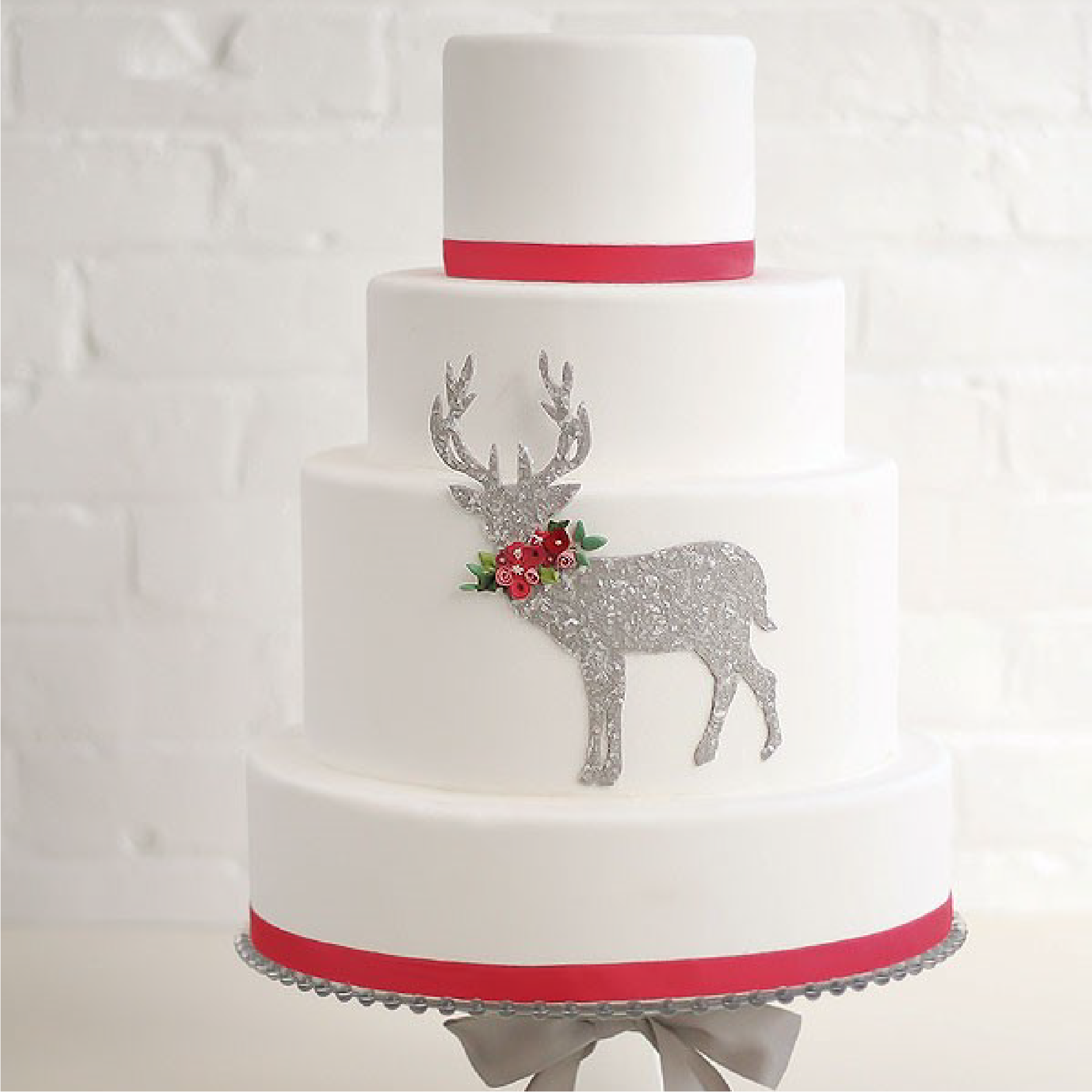
I’ve always been a bit of a non-conformist. My freshman year of college I was voted “Most Unique” on my dorm floor and wore the distinction proudly (although in retrospect it was most likely more of an insult than a compliment). When it comes to cakes, I gravitate toward unconventional designs and loose, rather than literal, interpretations of themes. For this cake, I wanted the design to be vaguely reminiscent of winter and Christmas yet unmistakably winter and Christmas, if that makes any sense.
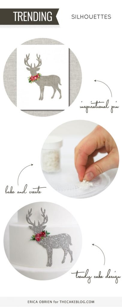
When I saw this floral stag Christmas print from Jones Design Company, I fell in love the way only a cake artist can: deeply and completely with a burning desire to turn it into a cake. I love the contrast of the pinky-reds against the blue- and yellow-greens, and the simplicity of the cut out against the white background. It’s exactly the kind of reinterpretation of a classic concept that inspires me.
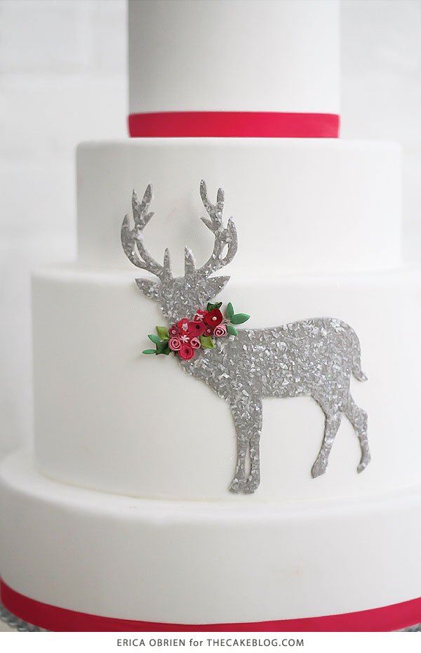
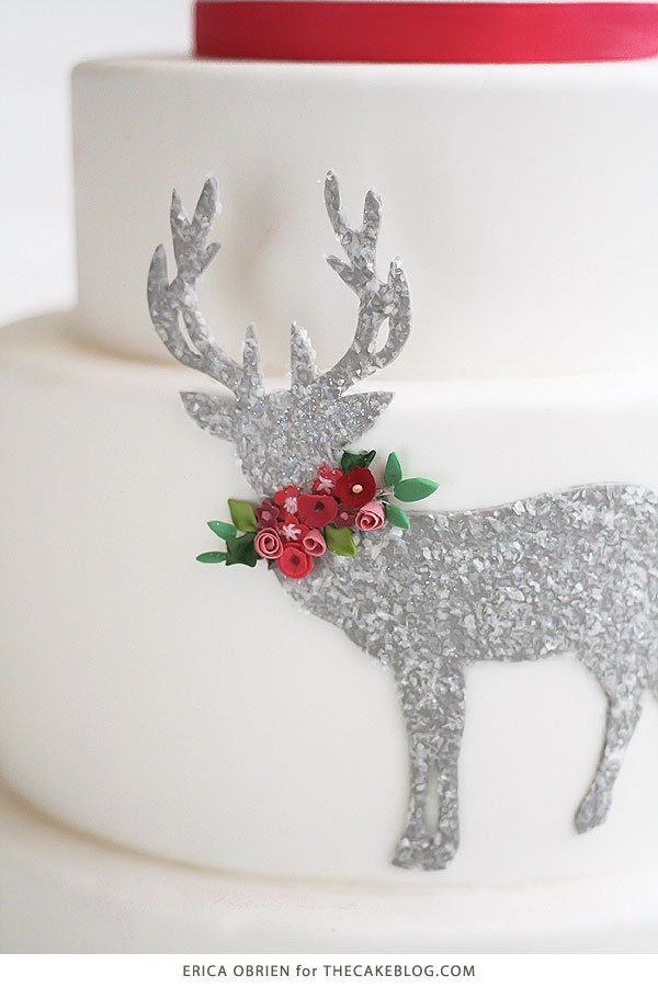
To create the design, we printed a template with the deer shape and then cut it by hand out of gum paste using a scalpel. We affixed it to the 9” round tier (second from the bottom) and placed a second (temporary) 9”round directly on top to offer the antlers support while they dried. We wanted to give the deer some texture and visual interest while also adding a wintry feel, but didn’t want an opaque and heavy glitter. The Wilton Edible Glitter is translucent, but the sparkles are rather big. To combat this, we crushed the sparkles by hand into smaller pieces. We then brushed the deer silhouette with piping gel and applied the glitter.
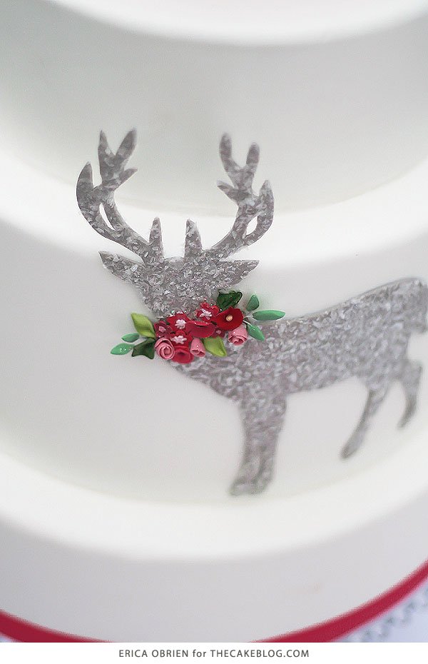
We made the flowers out of fondant (we normally use gum paste for flower work, but since these flowers were so small and did not require wiring, fondant was sufficient) and allowed them to dry. With the deer silhouette already dry, it would have been difficult for the flowers to adhere, so we applied a small strip of fondant where the flowers were to be applied, brushed it with edible glue, and gently pressed the flowers on.
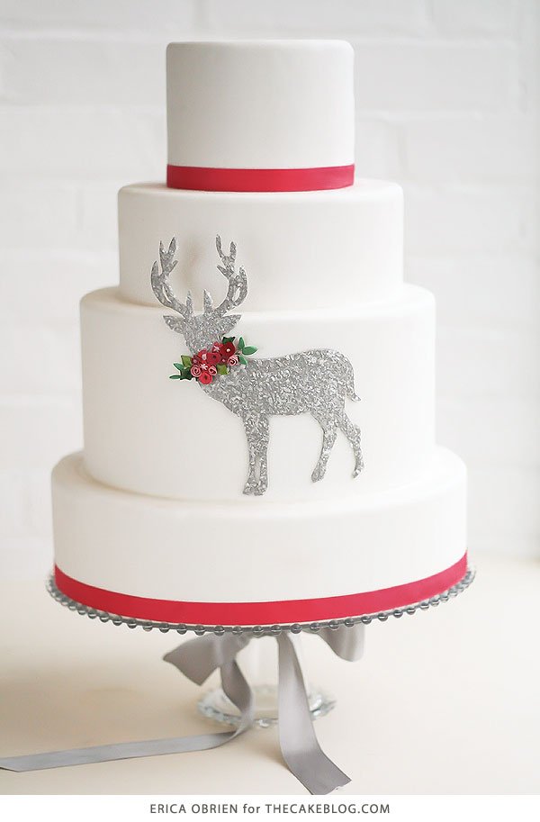
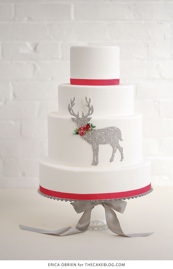
I initially conceptualized a three-tier cake that read like a single tier cake with all the focus on the center tier, but the sizing—a 7” on a 9” on a 11”—ended up looking like it was missing a top tier. Adding a 5” tier on top completed the silhouette but didn’t detract at all from the design.


 Sparkle Dust


